Population Profiles of the Most Populous Metropolitan Areas in the USA
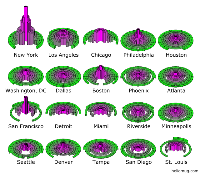
The plot below shows where the people in the 20 largest metropolitan areas live in relation to the city center. Height corresponds to density and volume corresponds to population.

Each ring represents a 4 kilometer wide ring around the city. Partial rings indicate area surrounding the city that is not part of the United States. This is generally either due to the center of the city being near a large body of water (Chicago, San Francisco, Seattle, San Diego, etc), or being near an international border (Detroit, San Deigo).
Motivation
If I'm being honest, this visualization is largely motivated by animus directed towards Los Angeles, where I live. Los Angeles takes a lot of flak for allegedly being a sprawling, sparesly populated urban wasteland. As I will explain below, it's actually fairly dense.
Sources
Assumptions
- In each city, city hall is assumed to be in the center of the city and all distances are measured from city hall. Though city hall is often near the most dense part of the city, but not always. For instance, in Los Angeles, most of the densest parts of the metropolitan area are well west of the city hall. This may mayke some cities look less dense than they would if we found a better center.
- In this plot, everyone in a particular zip code was assumed to be living on a point in the center of the zip code. I made this assumption out of necessity; the data set I had at the time had only a list of zip codes and populations. It would be better to use a more granular set of data, such as the set of census tracts or census blocks.
Process
- I used Java to parse, process, and write csv. I've since seen how easy it is with Python, so I'd probably do that if I had to start over.
- For each city, after I had all the zip codes sorted by distance from city hall, I dumped them in 4km wide bins. These bins I dumped back out to csv. I imported that data directed into Tableau for the visualization below.
- I wrote a program from scratch in Java to make 3D cylindrical shells based on the density and render them. It's not perfect; some of the surfaces are covered by surfaces behind them. It gets the point across though. The images are also a little big choppy. In the future, I'd probably look harder for someone else's package to use.
Problems
- People from zip codes that should have been spread across more than one ring maybe have been dumped into one particular ring instead. This fact caused some continuity issues. For instance, even though Phoenix is nowhere near any bodies of water, there are some rings that just happen to have no zip codes located within them and so are very partial.
Conclusions
I admit that the city is far from perfect, but I want to drive home a few points:
- In most metropolitan areas in the United States, the reality is that most people who live in a metropolitan area don't live near the city center. Thus, even if the center of the city is dense, that may not have a lot of bearing on most of the residents in that metro area.
- Despite its reputation, central Los Angeles really is fairly dense.
- As far as outskirts in the United States go, the "outskirts" of Los Angeles are quite dense. As far as I can tell, this is primarily due two reasons:
- Los Angeles really is very multi-centric. Within 25 miles of downtown Los Angeles are Santa Monica, Long Beach, Pasadena, and numerous other smaller urban centers.
- We've filled the entire Los Angeles basin with city and we've nowhere to go but up / in.
Interestingly, central Los Angeles (roughly bounded by the 10 Freeway, the Los Angeles River, La Cienega Boulevard, and the foothills of the Santa Monica Mountains) is smaller than the city of San Francisco, yet has essentially the same population.
Tableau Visualization
The Tableau visualization below inclues data from the fifty largest metropolitan areas in the United States.